 Hey!
Hey!
Welcome from the world of email to the World Wide Web.
Thanks for clicking through to read this little story about book covers
I wanted to share with you today my journey through one of the hardest aspects of being an independently published author.
That is simply getting your cover right.
 I’ll be honest. Most of my books sell on Amazon and other internet stores. That means I have exactly this amount of space to show you my book cover, and make it interesting enough for you to click through and read more, before hopefully buying the book.
Get the cover wrong, and my novel or non-fiction becomes invisible to you. You don’t read my blurb, you don’t buy the book, and you don’t get to read my work.
There are two problems: first, is that tastes and trends change, and very quickly. One cover might work for a season, then very soon look out of date as a new trend of cover comes on the scene. Try looking up your own favourite books: I bet you’ll find many of them has changed their covers since you read them.
The second is specific to the independent publishing world: there’s an ongoing debate about whether your cover should stand out from the group of other similar books around it (it’s genre, or category), or whether it should fit in completely naturally with every other book like it.
A house with a single lit window anyone? A single figure, in a shadow, looking into a narrow passage way, perhaps? Some cartoony women, with handbags and glasses of wine? A fully dressed up and armed ork or troll with an amulet, surrounded by lightening and coloured clouds? A photo of two next-to-naked people, kissing, on the brink of… well, you know what?
Compare that with the stunning stand alone sheer ingenious of, say, Irvine Welsh’s Porno, the original Clockwork Orange, by Anthony Burgess, The Godfather, by Mario Puzo, Sylvia Plaith’s The Bell Jar, and the unmistakable The Female Eunuch, by Germain Greer.
Me, I waver.
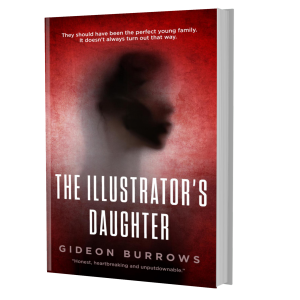
Take my novel The Illustrator’s Daughter, about a man’s obsessive love with his wife, and then his fight with her about what they should do to attempt to save their daughter’s life.
Since the daughter would be spending a lot of time in hospital, I thought something medical: the usual trope of a hospital bed in a dark corridor perhaps?
But this was modern fiction, not a medical drama. I wanted something a bit more, I don’t know, etherial? (Note that phrase ‘I wanted’? Yeah, I learned quickly it should have been about what my readers wanted. Anyway…)
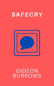
I had recently published my first novel, Portico, which had a particular style, so I had the second novel designed along the same lines. At that time, the book was going to be called Safeword, and then Safecry (until I finally decided both of those titles were too ‘porny’).
Here’s the two covers together. So, you get what I was trying to do.
 |
 |
|---|
But for one reason or another, the other being I realised how inaccessible the cover of Portico was, I came up with a bunch of other ideas, to make it all a bit more intriguing.
Some first attempts:
 |
 |
 |
|---|
Finally, I tried to copy some recent modern literary fiction. This following was the result. A bit weird, a bit intriguing, also probably a bit crap. Though it was definitely on mark with other take-yourself-seriously literature books I was trying to fit in with. See here.
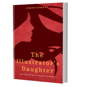
Still not satisfied, and not delighted with sales either, I brought in a great designer to overhaul my offering over four of my novels, giving them the same theme. We didn’t steer too far from the last design for The Illustrator’s Daughter’s, but I think it was far enough to totally strip the cover of its original meaning – leaving it neither in the medical thriller section, nor in the literature section, and nor – especially because it was part of a series – an incredible, stand alone design.
Try hard. Die hard. But it’s okay, because with independent publishing, you can keep changing. Adjusting. Testing. Even enjoying the process.
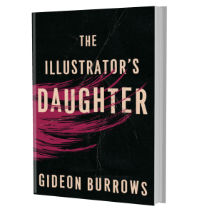
So, as I write, my current mission is to overhaul all four of those books once again. By the time you read this, The Illustrator’s Daughter will have this cover. It has exactly the haunting, questioning, uncomfortable feel that the novel has. I think it fits well with its competitors, but is original enough to stand out? Watch this space!
Thanks so much for sticking with me on this (painful) little journey. It was exactly the same for Portico, and I’m only now learning to get it more right, more of the time.
That’s why feedback from readers like you is so important.
If you have a view, or if you’ve ever bought a book entirely based on its cover, please do let me know.
Until next time, have a great day.
Gideon Burrows
![]()